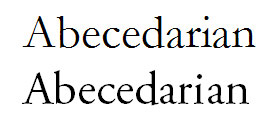
(as per commenter request: plain old Garamond [top] and Adobe Garamond Pro [bottom])
Adobe Garamond Pro. First discovered by Jeremy Freese on a daring writing expedition in 1997, it remains his favorite font.
welcome! jeremy freese is a professor in sociology at northwestern university. he finds blogging to be a good diversion from insomnia and a far better use of time than television.
11 comments:
Can you articulate the difference b/w that and Garamond? (Link provided for the benefit of other readers.)
Garamond has been a long-time favorite of mine (just the plain old one). I started using it around 1997/98.
That said, I don't just have one favorite (is that possible?). It depends on the context. For example, I don't like Garamond on Web sites. I prefer Verdana, a certain size. I also like Trebuchet for some things.
I put these side by side up top. AGP is my favorite on paper font. I've had a fondness for using Georgia in PowerPoint, but I've worried it looks a little frivolous.
I'll have to add that to my tech. budget if I ever finish this dissertation.
Thanks, it's helpful to see them side-by-side, I can see the difference better now.
I forgot the specifics of PowerPoint. One of the basic rules (are you now going to ask "by whom"?) of presentations is that they should only include sans-serif fonts. Georgia seems to be a serif font so I think you need to move on to something else. That's where I use Trebuchet a lot, now I remember.
Yes, I lately just use Arial for that reason. I have no affection for it, though.
i like arial. i think it is because i had a job in which everything had to be written in arial. looking at other fonts wigged me out for a long time.
I don't have a favorite font. That must be my problem. I'm not discerning enough in my selection of fonts.
I do agree, though, that this AGP is quite nice.
There is a newer version from Adobe--Adobe Garamond Premier Pro. Time to upgrade your font collection!
If you use a sans serif for Power Point, try Verdana instead of Arial. Not only is it specifically designed for screen viewing--computer or projector screen-- but it is a better looking font, by the great font designer, Matthew Carter, who also designed Georgia and the headline fonts for the New York Times.
Midwest Reader: I like the way Verdana looks onscreen. Indeed, I use it on this very blog.
Tonya: It's good that you are open to many fonts. You don't want to become one of those stunted people who wigs out when confronted with anything beyond Arial.
Dorotha, I thought you had to use Helvetica at that job? Or is Arial the New Helvetica? I'm so behind.
I like the chunkiness of Century Gothic, but it is admittedly diificult to read.
i'm not stunted, jeremy, i have a structural abnormality in my brain.
and the font was definitely arial, ang. we had to expand it, too. times tends to look all scrunched up to me because of the spaciousness of arial expanded bt 0.5.
Post a Comment