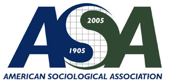
...the ASA centennial logo is just plain ugly. I don't know what committee was responsible for choosing it, but the combination of uncompelling colors and quadrille paper gets a big JFW thumbs down.
There, I'm so glad I finally got that off my chest. Of course, I'm expecting the ASA Secret Police to come bursting through the door any second now to take me away. As tolerant as sociologists may be in other ways, the Association has no compunction about killing dissidents when it comes to their logos.
3 comments:
It's surprising, but my experience with sociologists leads me to believe that most are very intolerant. They tolerate people who hold views similar to their own, sure, but dissent in any way, and they'll bite your head off.
I say Right On, Man! to respondent #1 - ASA staff were drunk and consulting the I Ching when they came up with that logo - good god! Couldn't they come up with something better than Ying and Yang - people are going to accuse them of being Communists using a foreign symbol like that - I took Soc. 101 last semester and there won't be any more Soc. classes on my resume' unless that logo gets trashed and flushed.
(Arnold Swogstein)
Speaking from a background in design, and having seen hundreds of logos from beginners, that is a seriously ugly logo. Any one of our juniors could come up with something much better...
Post a Comment