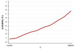
The variable on the x-axis is a uniformly distributed variable, as in say "deciles." The y-axis is the probability of observing the outcome. As you move from the lowest to highest "decile," the probability of observing the outcome increases from less than 10% to almost 80%. By the standards of social science, I would call this a "strong effect." Would you call this a strong effect? Someone, validate me!
I will post about what this graph is actually a graph of when I get a chance. It is not a graph of the probability of my getting on a mechanical bull by the number of vodka-and-cranberry-juices consumed. Guesses welcome, with the usual coveted JFW kewpie doll as prize.
9 comments:
This is definitely a "strong effect." If this were a stock on the NYSE, I'd be buying shares.
It looks like a strong effect by my anti-social science standards, too.
Is y something to do with Jeremy being awake at 4am?
Don't have to tell us something about dispersion before we can answer?
Dan: I said x was uniform and since y is a probability, var = p(1-p), so what more about dispersion is there?
Sister A: Sometime I'll have to sit you down and explain the "rational expectations" theory of stock prices.
Lucy: No, I can't even come up with a good example of what this graph would be as a jeremy-as-noctural graph.
Whoops! I stand corrected... Geez, that's depressing. I've been chair too long.... What's a probability again???
x = caffeine consumption
y = prob. of being awake at 4am
x = pats of butter on a slice of toast
y = probability of slice of toast falling butter side down when dropped
X= the number of total assignments (i.e. homework, papers, exams) on the syllabus
Y= the probability that half your class drops after the first day
Not a chance, mate. Let Y be Prob(dead) and X be age in years (ok, this doesn't fit your graph exactly, but it's close enough): Does age have a "strong" effect on death? I wouldn't know how to answer the question just from your graph because math or graphs don't speak to the question of How Big is "Big." Knowing that Xis uniform doesn't help me a bit. Relatedly, I say, Down With Standardized Coefficients, because the lull us into sociological complacency about taking a good look at reference scales and units of measurement!
Post a Comment